For most product brands, packaging is the first physical object a customer ever holds — before the product itself, before the manual, before anything else. That makes it one of the highest-leverage brand touchpoints a company has, and yet it’s frequently treated as an afterthought bolted on after the product and logo are finished.
A rigid magnetic-closure box reads as premium before a customer reads a single word on it. A kraft mailer with visible corrugated flutes reads as sustainable and unfussy. The structural choice you make sets expectations that your graphic design then either reinforces or contradicts — so structure should be decided as part of brand strategy, not after it.
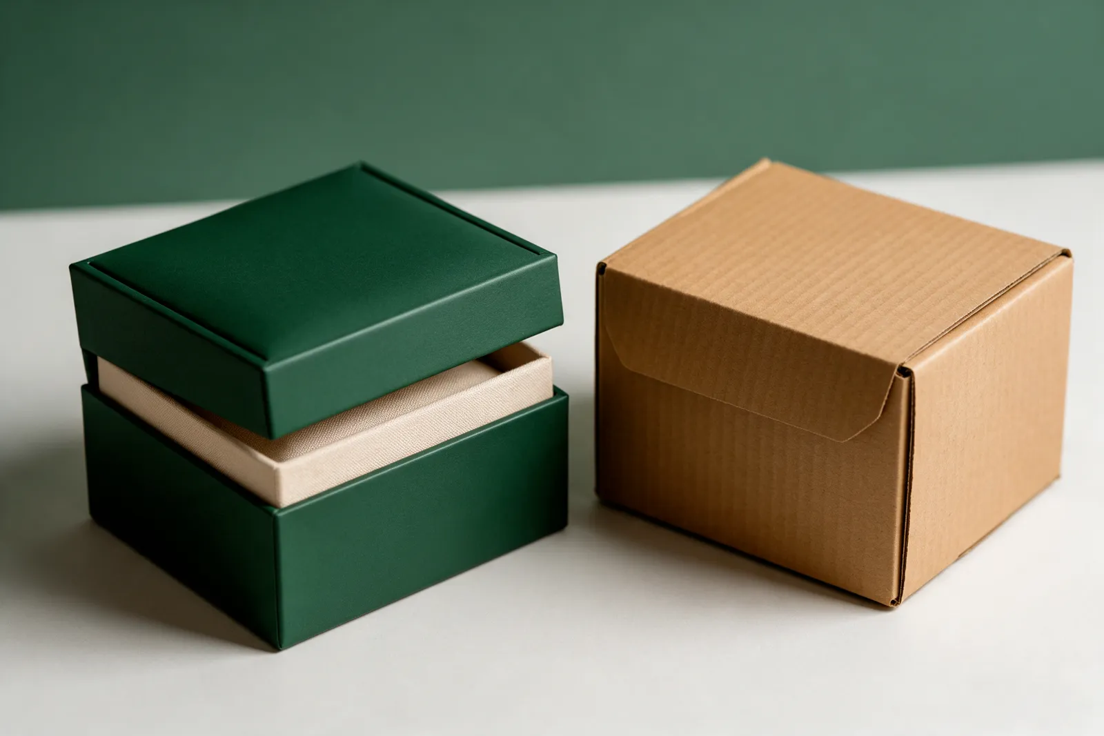
FSC-certified board, soy-based inks, and minimal-plastic assembly aren’t just sustainability checkboxes — they’re brand signals that customers increasingly notice and reward. Brands that lead with material honesty tend to build more durable trust than brands that rely on marketing copy to make sustainability claims.
Soft-touch lamination invites a customer to keep touching the box. Spot UV on a matte background draws the eye to a logo without shouting. Foil stamping signals occasion and luxury. Each finish is a deliberate lever for the feeling you want a customer to associate with your brand, not just a decorative upgrade.
The outer shipping box, the inner product box, any tissue or inserts, and even the tape used to seal a parcel are all part of one continuous brand impression. Brands that treat these as a single designed system — rather than separately sourced components — create a noticeably more cohesive unboxing experience, which is exactly the kind of moment customers screenshot and share.
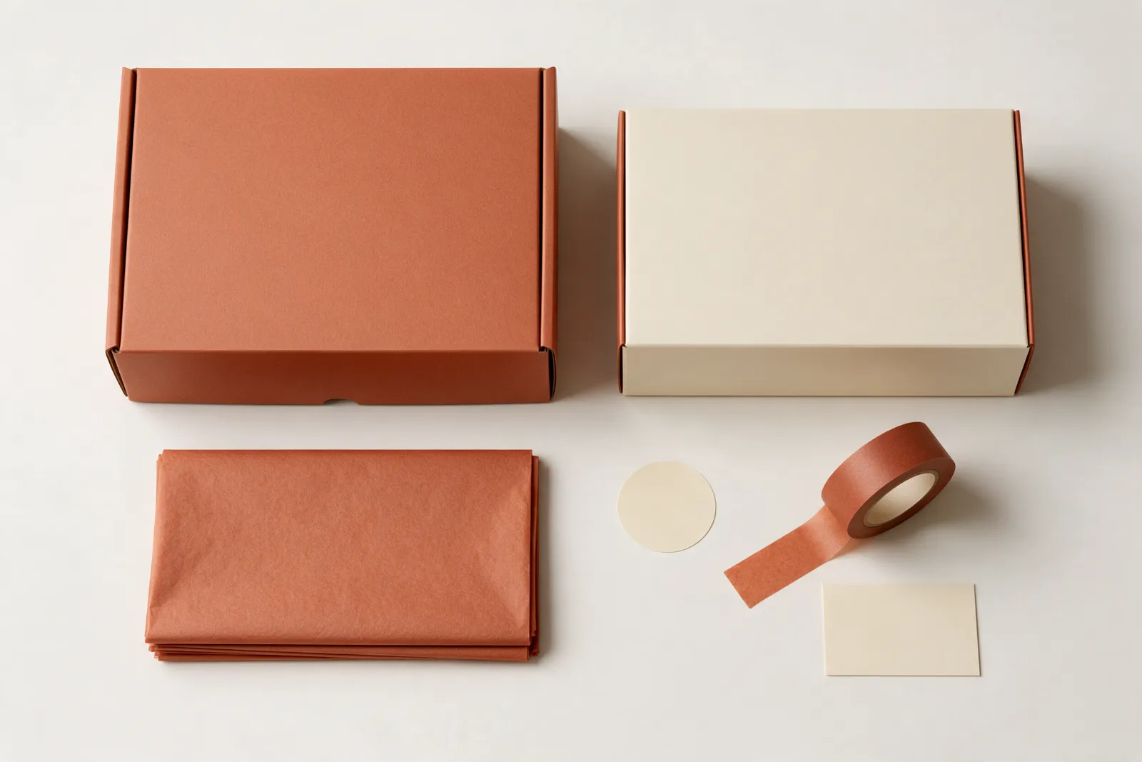
If you’re building out packaging for a new product line, start the structural and material conversation at the same time as your brand identity work, not after it. It’s easier to get right the first time than to retrofit later.
Get in touch — we're happy to send a free first-pass concept for your packaging project.