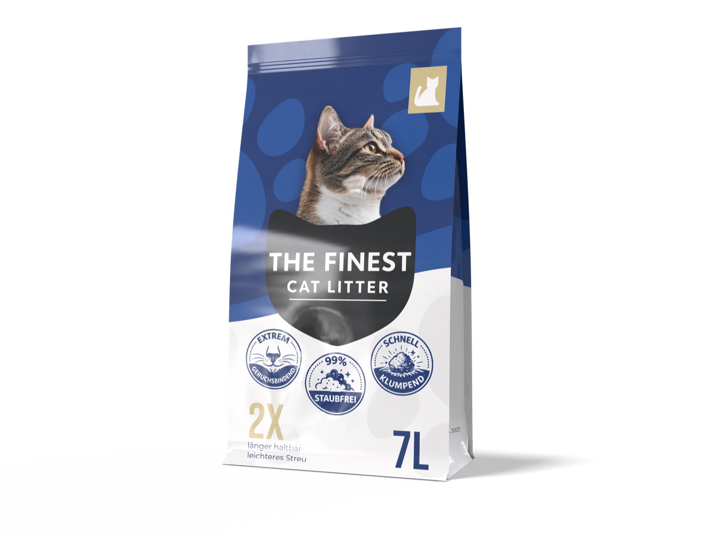
The Amazon main image is, statistically, the highest-ROI design surface in e-commerce. It’s the image that decides whether a buyer clicks through to your PDP at all — and on mobile, where 70%+ of Amazon traffic now comes from, it’s the only image they see in the search results.
Despite this, most listings ship with main images that were designed for desktop browsers in 2018. White background, slightly off-center product, no thought given to visual priority.
Design for the thumbnail, not the PDP
Open Amazon on your phone. Search a category. Pause. The product images you see are roughly 120 pixels wide. That’s smaller than a postage stamp. Anything that doesn’t read at that size is wasted pixels.
- Product fills 80–90% of the frame on a phone-sized thumbnail
- No tiny text — anything below 24pt at full size disappears at thumbnail size
- Single, dominant color in the product silhouette so it stands out from the white BG
Compliant ≠ boring
Amazon’s main-image guidelines (white background, no graphics, no text) feel like creative handcuffs. They’re not. The constraint is the brief — within those rules there’s huge room for product staging, clever in-package framing, and visual contrast tricks that move the needle.
If your main image isn’t your number-one design priority for 2026, you’re shipping money to your competitors.